ShopDreamUp AI ArtDreamUp
Deviation Actions


Suggested Deviants


Suggested Collections


You Might Like…


Featured in Groups


Description
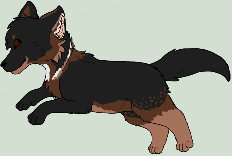
random title is random
A little drawing of Maple to test out the tablet~ c: LOVIN IT.
I reallllllyyyyy like this drawing. She looks like a wolf, even though she's a german shepherd .w. But thats the best german shepherd I've ever drawn. So Im really proud of this.
AND HER COLORS ARE ACTUALLY SIMILAR THIS TIME 8D
Also, critiques maybe? owo First tiiimmeee 8DD
Image size
1097x738px 202.23 KB
© 2012 - 2024 A-wild-Day-appeared
Comments3
Join the community to add your comment. Already a deviant? Log In
Hello! I will not be using stars for this critique, because I think they are pretty unnessecery. Please just ignore the stars. <img src="e.deviantart.net/emoticons/s/s…" width="15" height="15" alt="
Cons:
The eyes seem a bit too close to the edge of the muzzle, next time try to move them a bit farther away. I think the tail looks kind of like a cat tail, because it is pretty long. The nose could be a little bit bigger. And finally the hind legs are short, and should be made a tiny bit longer.
Pros:
The body structure is amazing! I love the paws and the eyes. The design is beautiful. The dog's size is great; not too skinny and not too plump.
If you would like to improve, I suggest studying the anatomy of dogs, specifically if you are going for a certain breed. Maybe watch some videos to see the way a dog's body looks when it is walking, jumping, running, all of that. That's all I have to say, I love the picture and I hope the critique helped!